

If you were to ask a 2nd grade class to design a super readable, human-friendly, clear briefing for pilots, they’d probably come up with some good ideas. Kids have a good eye for design, and spend a lot of time drawing and coloring things in. They also have a better ability to keep concepts simple, and see problems in clearer ways than we super-smart adults do.
What they would be very unlikely to do, is propose the telegram format nonsense that we currently use (let’s call it the Nastygram). Kids would know this is dumb. People can’t read it.
Even more unlikely, if we were to imagine a scenario where there was a tender to design a Briefing system for pilots (adults this time), is that the Nastygram would win. Someone would get fired if that was even proposed.
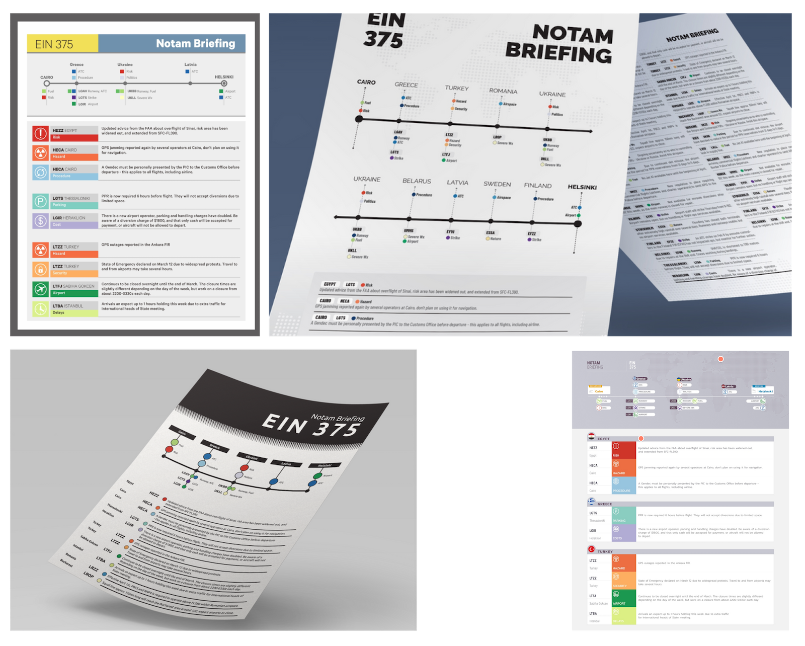
So, if we start from scratch, what might it look like? We thought we’d ask some people with ideas – you know, designers. Here’s what we got. They used revolutionary concepts like color, plain language, normal case, and flags.
Feels like a good starting point for a discussion.
1. The Colors

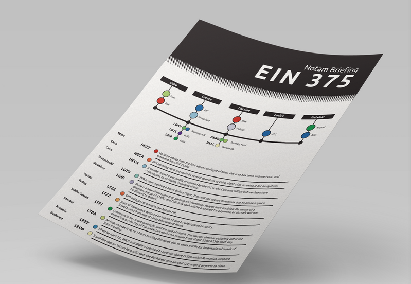
2. The Condensed
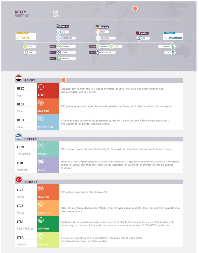
3. The Flags
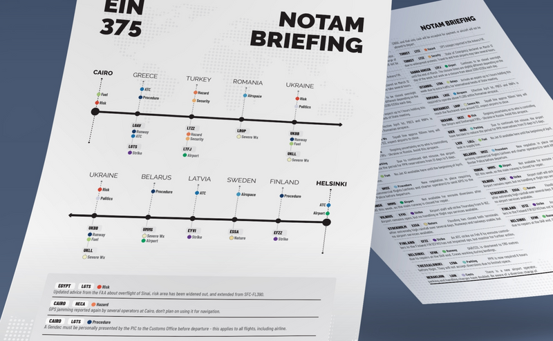
4. The Timeline
Four starting points. Will you tell us which one you like best?
We made a tiny survey (30 seconds) – just choose your favorite here.
The design group in the Notam Team will use your feedback! Thank you!


Grouping same time of info under larger heading would help ie: OBSTACLES or PARKING. It would be easier to implement than fancy colors
I’d vote for the flags version if choosing from those four. Not listing in order of importance is a major drawback of the current system this appears to rectify.
While the use of colour is nice in all four designs, it must be recognised that most users will be reading these on monochrome printouts, so the system can’t rely on colour to interpret the data.
First of all, congratulations to who were involved for a bit of thinking outside the box. Much appreciated.
If you can handle a bit of constructive criticism, I think the examples shown have gone almost as far in the other direction. I count 6/7 different fonts, 12+ colours, various font sizes and a “condensed” version that would run the printer out of toner after not that many copies. They have the feel of an article from Wallpaper*.
I’ve just had a look at a “brief” from a flight I did earlier this year and it runs to 80+ pages of monospaced type. The NOTAMs must be at least 60 pages of that. Bear in mind that I often have ~5mins to digest the important bits of it, before meeting/briefing my crew, deciding on fuel, etc. so it’s got to be quick to read, consistent and information dense. There should be a sweet spot between abbreviated to the point of incomprehensibility and verbose to the point of distraction.
Snazzy graphics should be kept to a minimum (preferably not at all) and the document readable in monochrome. A Consistent interface will be key – take into account the knowledge and skills of the target audience: pilots. Abbreviations like RWY, TWY, AD, ILS, etc. are known to all but usng nrml wds tht hv hd rndm ltrs rmvd is confusing at the best of times. A lot of aviation information is numerical by nature and becomes slower to parse when expanded to its fullest extent, e.g. FT271103Z 2712/2812 17005KT 9999 SCT030 BECMG 2715/2718 23010KT PROB30 TEMPO 2715/2724 7000 SHRA BKN045 can be understood almost in a glance by most pilots but the full English version would go on for ever.
I’m sure this will be an iterative process and you’ve got to start somewhere. I would hope that process includes tests of speed and accuracy (by actual pilots) in terms of retrieving relevant information, as that has got to be the ultimate goal. A worry is that we need everybody who authors NOTAMs to agree to the new logic; where I work NOTAMs are transcribed verbatim in case any meaning is lost or corrupted and also for liability reasons. Good luck!
I think Ed’s comment is fair, although I do love all the colors 🙂
I have filled in the survey but just remembered another thing… there isn’t a map. So although there are numerous airports mentioned in the sample briefings above, it doesn’t show where they are (very important at times!).
And would digital notams (i.e. on a tablet or so) follow the same layout or be different?
Keep up the great work!
Colors
It seems to me that as long as we design the raw NOTAM format to be fully machine readable with no ambiguity or inconsistency, we could make apps display them in any fancy format we want to. As Ed has pointed out, there are some pilots who are used to more condensed versions and colors don’t work for monochrome printers. And there are pilots for whom graphics and colors work better. I don’t think there is a one size fits all solution for displaying NOTAM information.
I agree with Stefan, there should be a map, especially in order to depict airspace NOTAMs in a meaningful way. Goran has a good idea of grouping the same type of info under headings would be helpful, but I think there’d need to be sub types for each type which would allow the NOTAMs to be sorted within each group.
The flags, seems like the best combination of the 4 style/content presentation ideas.
Hello,
What I think is that the number of NOTAMs is too big. Airfields and FIR try to cover themselves with having all infos covered. What if there are too many and nobody is able to read them all? Is it safer? No!
I am for a penalty for having more than à certains amount of NOTAM per airfield.
I would like as well that after an AIP cycle, those informations should be transférés to AIP and Plates/docs provider with a change notice and then deleted from the NOTAM system.
Thanks for your initiative!
Corentin